Hands-On – Laurent Ferrier Galet Classic Tourbillon Dual with Open Dial
Laurent Ferrier is first and foremost a watch passionate and watch designer (he has spent 37 years at Patek Philippe, ending his career as creative director). He’s not one to show off or boast about his achievements, preferring instead to let his exceptional work speak for itself. Even then, he likes to keep things understated, at least on the dial side, ensuring the focus remains primarily on functionality and practicality (although the watches are gorgeous to look at too.) This year, however, he has finally bowed to the wishes of some of his passionate collectors and, for the first time ever, created a watch where the tourbillon is visible from the dial side – stocking for some, desired by others… Today, we’re going hands on with this beauty, which still features all the technical hallmarks of a wonderfully elegant Laurent Ferrier timepiece.

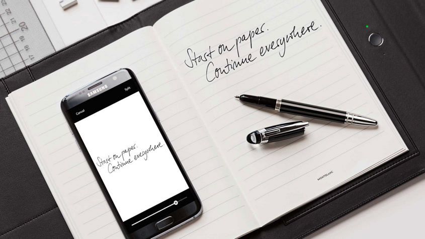 Yes, I know — this isn’t a watch. So what are we doing talking about it? Well, when we met with Montblanc to talk about their inaugural smartwatch – the Summit – they also showed us their Augmented Paper. Suffice to say, we were confused, fascinated… and when we saw it in action, impressed. Aside from the technology and how seamlessly it worked, the real standout is the fact that Montblanc is playing in this space at all. It would be easy for the brand to lean on their heritage status and stick to the tried and true formula of writing instruments, leatherwear and timepieces. To be sure, we’re not suggesting that these connected objects will replace the Meisterstück et al as core business, but it demonstrates that Montblanc is invested in keeping pace with the evolution of writing and the written word while ensuring their relevance in contemporary and future workplaces.
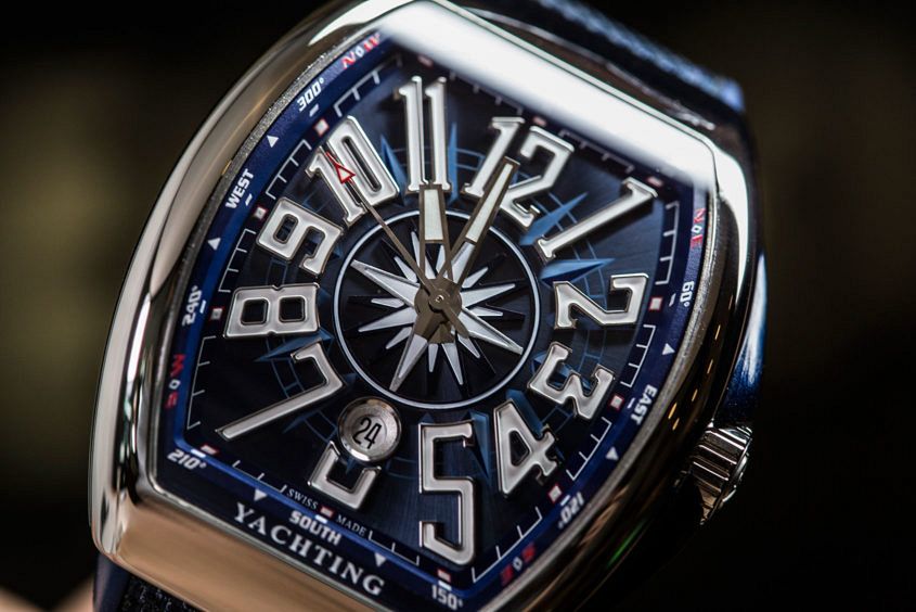 Editor’s note: Ready your chinos, chains, and jackets with rolled up sleeves — yacht rock is upon us. Only this time, it’s Franck Muller rather than Kenny Loggins who’s bringing the OTT, Champagne-fuelled fun, in the Curvex-y form of the Yachting collection. The name gives the game away a little, but the Yachting watch offers a fresh nautical feel on the wrist. The marine allusions start with the dial, a shimmering navy blue that pairs well with the bright white Arabic hour markers. On top of that the centre of the dial displays a compass rose, a navigational motif that is picked up in the outer section of the dial (complete with lines of latitude and longitude), with bearings on the outermost section. If you were still on the fence about the world this watch lived in, the ‘yachting’ text at the bottom of the dial will seal the deal one way or another. There’s no denying that there’s quite a lot going on with this dial, and it won’t be for everyone. But it’s colourful and fun, and would definitely look the part on the pristine white deck of a mega-yacht. Like most of Franck Muller’s line-up, the Yachting…

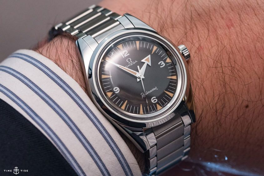 Seeing Omega’s 1957 Trilogy 60th Anniversary boxed set in the metal was one of the highlights of Baselworld this year for Andrew, Andy and myself. Not least because we realised that seeing these three pitch perfect reissues in one place ever again was unlikely, given the astonishing demand. And while getting your hands on the big boxed set (limited to 557 pieces) is a nigh-on-impossible task, we suspect getting one of the Speedmaster, Seamaster or Railmasters limited to 3557 pieces each is more achievable. The only question is, which one do you pick? Read on for what we chose, and why. Andy’s choice – the Speedmaster Why I chose it… Aside from being a genuinely handsome watch, I really like how similar the proportions and details are to the original (having tried on both the original and the modern). I specifically LOVE the size, which at 38.6mm, is so close to the 1957 original (ref CK2915), which was 38mm. We so often see tribute pieces with cases that have been inflated over time, when they just don’t need to be. It’s honestly one of my favourite reissues that I’ve seen over the years. Why you should… In my opinion, it’s perfect for all the…
 Last year, Cartier launched a brand-new collection: the automotive-inspired Drive de Cartier. However, unlike much of the brand’s other offerings which have cross-gender appeal, the Drive de Cartier is intended solely for men. It has proven to be a hit the world over, with a case that is neither round nor square. Instead, its elegant curves form a rounded cushion shape, which is unmistakably masculine – but not in a macho kind of way. To use an automotive analogy, it’s less brute Mustang muscle and more the sophistication of an Aston Martin. The crowning achievement of the collection is the Drive de Cartier Flying Tourbillon with its in-house, mechanical tourbillon, caliber 9452 MC movement that’s been hand finished to a high degree to meet the standards of the Geneva Seal certification. However, it’s not just the movement that is impeccable. The dial is a richly contrasting display of satin-brushed surfaces and intricate guilloche finishing. Cartier has created a sense of depth by open-working the outer dial that displays the markings for the hours, minutes and seconds, and exposing the white galvanised guilloche below. Despite the elaborate interplaying layers, the dial layout manages to come across as simple and elegant. The…